Unlocking 7 Hidden Benefits Through Web Site Redesign, by @uxmatters.bsky.social:
Recent searches
Search options
#usability
Godt foredrag
https://vimeo.com/1070654115
Ich hab gehört, im Fediverse interessieren sich ein paar Leute für #Digitalisierung und #IT?!
Gut zehn Minuten Eurer Zeit für die Masterarbeit eines Freundes: eine #Umfrage zu #KI und #Chatbots in der Kommunalverwaltung.
#Datenschutz, #Privatsphäre, #Usability - was ist Euch wichtig? Sagt es ihm für seine Studie
https://hcicaachen.fra1.qualtrics.com/jfe/form/SV_e8UNu6D47p2tHwO Boosting is sharing! Für die Forschung!

#Web #usability and #accessibility ...
This is from crimethinc.com, but I'm not trying to pick particularly on them. There are many, many, many sites just as bad or worse.
This is a screenshot from an article on their site today, rendered in Firefox (Linux).
See the hair-thin font? See the fact that it's light grey on a white background? There's virtually no contrast between the text and the background.
This is an accessibility nightmare for those with any sort of vision problem. Picking the colour out of the screenshot (I didn't look at the CSS), it appears the text is basically 45% grey. This is ludicrous.
If the font face had some heft, it might be still be half-assed readable with contrast this low.
But as is... If I were to take my contacts out, I wouldn't even be able to tell that this screenshot *had* any of the normal-sized text in it, much less be able to read any of it.
Web designers, I beg you: please consider more than the appearance of what you're creating when you're making design choices.
Remember that not everyone is a 20- or 30-something with near-perfect vision.
Remember that people have cataracts or other types of eye cloudiness which necessitate high-contrast text to be able to read, even if they scale the fonts up by a huge amount.
Remember that vision degrades naturally in people in many ways other than "just wear glasses" can fix.
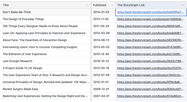
I've added The StoryGraph links for all books in the Monster List of UX Books:
https://www.airtable.com/universe/expqM3OWZoJkjl7wy/the-monster-list-of-ux-books
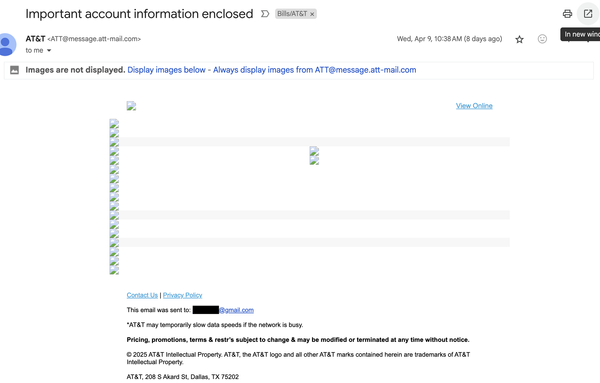
This is AT&T's email with images blocked. Fail! #email #att #a11y #usability
Dat feelz when the binary comes with its own bash completion generator #hugo #bash #usability #ux
Bike rack producers: »Let's create more front wheel bike racks because – reasons.«
Cyclists using these bike racks:
#Development #Techniques
Multi-step logins with password manager support · The problem with email-first logins and how to solve it https://ilo.im/163at0
_____
#Logins #Forms #Passwords #PasswordManagers #SSO #Accessibility #Usability #WebDev #Frontend #HTML

User: Hey, Mastodon, can you enlarge this timeline image for me? (1)
Mastodon: Hold my beer... (2)
#mastodon #mastoadmin #mastolivre #ux #ui #gui #usability (or rather lack of it)
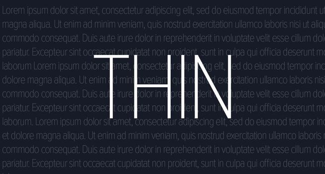
Thin Fonts Are a Usability Nightmare—and Finally, Designers Are Waking Up, by @webdesignerdepot.bsky.social:
Usability Improvements in GCC 15
https://developers.redhat.com/articles/2025/04/10/6-usability-improvements-gcc-15

In #Munich, the surface metro is called "S"-Bahn and the underground is the "U"-Bahn. There's this elevator on my way to work that has these three buttons: "O", "S" and "U". Which one would you pick to get to the "S"-trains when you're coming from the "U"-trains?
Over and over I've seen tourists with suitcases make the wrong choice in this elevator. It bothered me so much that I've printed a label to fix the #UX of this #usability disaster.
It's been there for 2 weeks now
Jo Minney on Website Usability Testing for WordPress Projects, by @jominney.bsky.social and @nathanwrigley:
https://wptavern.com/podcast/162-jo-minney-on-website-usability-testing-for-wordpress-projects

Direct Access vs. Sequential Access: Why Direct Is Better, by (unattributable):
Bulk Actions: 3 Design Guidelines, by @nngroup@x.com:
Report From the California Digital Library (CDL): "Ebook #Usability Report on Aggregator Platforms: A Case Study of EBSCO and ProQuest" https://www.infodocket.com/2025/04/04/california-digital-library-cdl-ebook-usability-report-on-aggregator-platforms-a-case-study-of-ebsco-and-proquest/ #ebooks #libraries
It would be great if #mastodon would allow ctrl+enter (or cmd+enter on mac?) to suspend an account when typing in the custom note box.
Wikipedia im neuen Look: Was sich jetzt ändert
https://techupdate.io/dienste/wikipedia-im-neuen-look-was-sich-jetzt-aendert/50253/

